AI Adoption Effectiveness Misleading: Selection Bias Revealed
A recent article in Towards Data Science highlights a common issue with AI adoption metrics, where features like an AI assistant are often attributed credit for customer retention improvements. However, this attribution is flawed due to selection bias. The analysis of 40,000 B2B accounts shows that the feature did not directly cause better retention; rather, it was tied to more engaged and ready…
Key points
- AI feature adoption does not directly cause better retention
- Adopters tend to be more engaged and ready customers
- Selection bias inflates the perceived effect of AI features
Your AI Adoption Lift Is a Selection Effect
Towards Data Science · 13 September 2026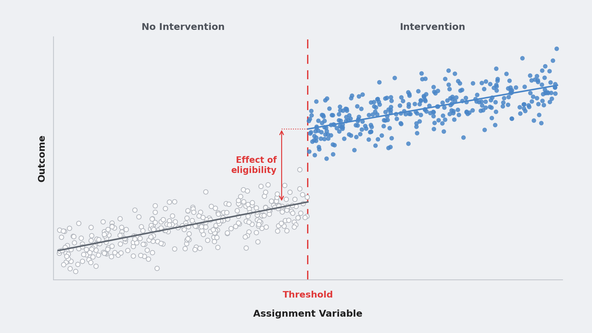
Somewhere in your company there is a slide that says something like this: customers who enabled the AI assistant retain 15 points better than customers who did not. It has a bar chart. It has been in three executive reviews. It is driving next quarter's roadmap.
Nobody randomized the AI assistant. It shipped to eligible accounts, some of them turned it on, and the analytics team compared the ones that did against the ones that did not.
That comparison is not an effect. It is a description of who opts in. The feature did not make those accounts engaged. Being engaged made them adopt the feature.
AI features make this worse than the average opt-in feature, and it is worth being specific about why. To adopt an AI assistant, someone at the account has to notice the release, enable it, trust it enough to put it in front of their team, train people on it, fold it into a workflow, and keep using it after the novelty fades. Every one of those steps reveals something about the account: administrator engagement, executive sponsorship, technical sophistication, product maturity, organizational appetite for change. By the time an account shows up as an "adopter," the flag is close to a proxy for organizational readiness. Readiness predicts retention on its own. The feature is riding on top of it.
The instinct at this point is to model the customer's choice harder. Add covariates. Match on usage. Build a propensity score. This article argues for a different move, and it is the one sentence I would keep if everything else were cut:
Don't model the customers' choice harder. Find variation the customers didn't choose.
The rest of this article is about doing that with the one piece of an AI rollout that no customer picked: the eligibility rule.
Define the question before the method
There are three different quantities hiding inside "the effect of the AI assistant," and the slide conflates all of them.
The effect on adopters. If the accounts that turned the feature on had not adopted, how much worse would their retention have been? This is what the naive comparison is trying to estimate. It is the number the product team wants, because it describes the customers who actually experienced the feature.
The effect on everyone. If every eligible account adopted rather than nobody adopting, how much would retention change? This is the number finance wants, because it is what a forced rollout or a default-on change would produce. It is not the same number as the effect on adopters. Whether it is larger or smaller is an empirical question about effect heterogeneity; in opt-in product settings it is often reasonable to expect adopters to benefit more, but that is an assumption, not a theorem.
The effect at the margin. For accounts right at the edge of eligibility, what does becoming eligible do to retention, and what does adopting do for the accounts that adopt because they became eligible? Those are two numbers, not one, and the distinction matters later. These are the quantities nobody asks for and the ones you can usually identify most cleanly. They are also the ones that speak to the decision most often on the table: whether to move the eligibility rule.
The naive comparison does not estimate any of them. It estimates the difference between ready organizations and unready ones, with a feature flag attached.
The setup
The synthetic dataset has 40,000 B2B accounts. The AI assistant is available only to accounts with 25 or more seats, a seat-count eligibility rule of the kind common in SaaS products. Among eligible accounts, adoption is voluntary.
The thing that makes this hard is a latent variable I will call engagement: how invested the account is in the product. Engaged accounts are more likely to turn on new features and more likely to renew regardless. The analyst never observes it. What the analyst observes is seats, tenure, whether the account adopted, and whether it retained six months later.
The true effect baked into the simulation is +4 percentage points of 6-month retention from adopting the assistant. Retention also trends smoothly upward with account size: bigger accounts retain a little better, feature or no feature. So the observed adopter gap will mix three things: the feature effect, selection on engagement, and the fact that adopters are drawn from larger, eligible accounts.
The full data-generating process is in the notebook. The part that matters is above: adoption and retention share a cause the analyst cannot see.
Method 1: The slide
Business question: Do accounts that use the AI assistant retain better?
What it estimates: The difference in retention between adopters and non-adopters.
Identifying assumption: Adopters and non-adopters would have retained identically absent the feature. Adoption is as good as random.
Fifteen points. The true effect is four. The rest is selection: mostly engagement, plus the fact that adopters come from larger, eligible accounts that already retain somewhat better.
It does not help much to restrict the comparison to eligible accounts, which is the usual first fix. Among accounts with 25 or more seats, the adopter gap is +13.9 pp. Restricting to eligible accounts removes the mechanical size difference created by the 25-seat gate, and it shrinks the gap by only about a point and a half. Nearly ten points of excess lift remain. The selection is not happening at the eligibility line. It is happening inside the eligible population, at the moment each admin decides whether to click the toggle.
Reading the result. This is not a lie, exactly. Adopters really do retain 15 points better. The slide's mistake is the caption, which says the feature caused it.
Method 2: Regression adjustment on what you can see
Business question: After accounting for account size and tenure, do adopters still retain better?
What it estimates: The adopter gap, holding observed covariates fixed.
Identifying assumption: Conditional exchangeability. Everything that drives both adoption and retention is in the model.
The adjusted estimate is +13.8 pp, with a tight confidence interval. It is precise and it is wrong, and the precision is what makes it dangerous. A standard error of 0.7 points looks like rigor. It is rigor about the wrong quantity.
If you had the engagement column, this would work:
You do not have the engagement column. Pre-launch product usage is the closest proxy most teams have, and it helps. But the confounder here is not "how much they used the product," it is "how ready they were to keep using it," and no pre-period covariate fully captures that.
Failure mode: proxies that are too good. The temptation is to control for post-launch usage, since engaged accounts use the product more. Post-launch usage is downstream of the feature. Conditioning on it removes part of the effect you are trying to measure. Every covariate in this regression has to be measured before the feature existed.
Reading the result. Regression adjustment moved the estimate from 15.4 to 13.8. When observed covariates barely move the number, that tells you those covariates, in that specification, are not explaining much of the gap. It tells you nothing reassuring about the confounders you cannot see. The identification argument is still there; it just is not credible.
Here is where the article is going. The third bar is the rest of it.
Method 3: Regression discontinuity at the eligibility threshold
Here is the thing the slide ignored. The feature is gated at 25 seats. An account with 24 seats cannot turn it on. An account with 25 seats can. Nothing else about those two accounts is systematically different: same tier of customer, same kind of admin, same distribution of readiness. The gate is arbitrary, and arbitrary is exactly what you want. It is the one part of the rollout that no customer chose.
Business question: For accounts near the eligibility threshold, what does becoming eligible for the AI assistant do to retention, and what does adopting it do for the accounts that adopt because they became eligible?
What it estimates: Two local quantities at the 25-seat margin: the reduced-form effect of eligibility on retention, and the effect of adoption for accounts whose adoption is induced by eligibility. This is a fuzzy regression discontinuity (RD), because eligibility does not force adoption; it only makes adoption possible.
Identifying assumption: Everything that affects retention, other than access to the feature, varies smoothly across the 25-seat line. The only thing that jumps at 25 is eligibility.
The mechanics are an instrumental variables (IV) problem in disguise. Eligibility is the instrument. Adoption is the treatment. Near the cutoff, the continuity assumption lets us treat accounts just above and below the threshold as locally comparable; eligibility moves adoption, and it has no other route to retention. That is the IV recipe, and two-stage least squares (2SLS) is the estimator. Measuring how much adoption jumps at the threshold (the first stage) and how much retention jumps (the reduced form) is the intuition; 2SLS does the division and gets the standard errors right, including the correlation between the two jumps that a hand-built ratio would miss.
Adoption jumps from 0% to 37% at the threshold. Retention jumps by 1.8 points. Per adopter at the margin: +4.9 pp, with a 95% interval from −2.4 to +12.1. The truth is +4.
Two estimands came out of that, and they answer different business questions:
If the decision is about changing the eligibility rule, the first row is the intervention you are actually contemplating. If the decision is about the value of the feature to a customer who uses it, the second row is the one you want. Bringing the wrong row to the meeting is the same estimand-drift mistake as the original slide, just one level more sophisticated.
Reading the result. The interval is wide. That is not a flaw in the method. That is the method telling you the truth about how much information a threshold contains. A 4-point effect diluted through a 37% first stage is a 1.5-point jump in the raw outcome, and detecting a 1.5-point jump takes a lot of accounts near the cutoff. The naive number had a half-point standard error because it was measuring something easy. The RD has a 4-point standard error because the identifying variation is much thinner. That is the price of throwing away the variation created by customer choice.
The diagnostics that make RD credible
An RD estimate without diagnostics is a number. With diagnostics it is an argument. Six checks, in the order I run them.
1. Bandwidth sensitivity. The bandwidth is how many seats on either side of the cutoff you include. Narrow is more credible and noisier. Wide is more precise and starts picking up curvature the linear fit cannot handle.
At ±5 the estimate is basically zero with an interval of ten points either way. That is not evidence of no effect; it is evidence that you have run out of data. Between ±10 and ±20 the estimate is stable. Report the range, not the best-looking row.
2. The running variable is discrete, and that matters. Seats are integers. At a ±5 bandwidth there are exactly ten distinct values of the running variable, and the untreated-side fit has to extrapolate from 24 seats to the cutoff at 25 because there is no untreated observation arbitrarily close to the threshold. Conventional RD inference assumes you can zoom in as close as you like. With a discrete running variable you cannot, so the fit's functional form is doing real work and specification error is part of the uncertainty. This is the normal situation in SaaS, where the gating variable is seats, licenses, or a tier. Two practical consequences. Treat the bandwidth and specification sensitivity table as part of the primary result, not a robustness appendix. And be careful with the common advice to cluster standard errors by the running variable's values: it is not a free fix; Kolesár and Rothe (2018) showed it can understate uncertainty, and in this simulation it shrinks the standard error from 0.037 to 0.021. I keep the heteroskedasticity-robust interval as a measure of sampling uncertainty, but I do not treat it as resolving the discreteness problem. That is exactly why the bandwidth and specification sensitivity results belong in the primary analysis.
3. Placebo cutoffs. Run the same reduced-form regression at seat counts where nothing happens. If retention "jumps" at 15 seats or 35 seats, your design is finding structure that is not there. One rule when choosing placebos: the window around each fake cutoff has to stay on one side of the real one. A placebo at 20 seats with a ±10 window would span 10 to 29 and contain the actual discontinuity, which is not a test of anything.
All noise. The only place retention jumps is the place eligibility jumps.
4. Nothing else changes at the threshold. Before using the cutoff, inventory everything else that changes there. If pricing, support entitlement, onboarding, an account-management tier, or contract terms also jump at 25 seats, the reduced form is the effect of the bundle, not the AI feature alone, and the exclusion argument for the instrument collapses. Seat-count thresholds in SaaS often do double duty. Check the price book before you check the data.
5. Covariate smoothness. Pre-treatment covariates should not jump at the threshold either. Tenure does not (jump = 0.06 months, se 0.24). In the simulation I can also check engagement itself, which is the point of the exercise: it is smooth across the cutoff (jump = 0.01, se 0.03). In real data you cannot check the unobserved confounder, which is why you check every observed one and reason about whether the unobserved ones would behave differently.
6. Manipulation of the running variable. This is the one that breaks RD in practice, and it is specific to how SaaS companies operate. If the sales team knows the AI assistant unlocks at 25 seats, they will upsell 22-seat accounts to 25 to close the deal. Now the accounts just above the threshold are not comparable to the ones just below; they are the ones a rep decided were worth pushing. Check the histogram of seats around the cutoff. A pile-up at exactly 25 is the tell.
Smooth in the simulation. In your data, look. If you see bunching, the threshold is not arbitrary anymore and the design is compromised. The clean fix is available only if eligibility was actually determined from a seat count snapshot taken before the feature was announced; in that case the snapshot is the running variable and the rep could not have gamed it. If eligibility was evaluated on live seat counts, switching to a historical snapshot changes the running variable without preserving the discontinuity in access, the first stage weakens, and you are back to arguing about whether the snapshot is a valid instrument. Sometimes it is. It is not automatic.
Which number goes on the slide
Four numbers came out of this analysis and they answer four different questions.
The two RD estimates are the only ones here whose identifying variation comes from the rollout rule rather than from customer choice, and they come with two honest caveats that belong on the slide.
First, it is local. It describes accounts around 25 seats. If the decision is "should we expand eligibility to accounts just below 25," the reduced form above is directly relevant. If the decision is "should we lower the threshold all the way to 15," you are already asking the estimate to travel beyond the population that identified it. And if the decision is "should we make it default-on for enterprise," neither number speaks to a 500-seat account at all.
Second, the two RD estimates apply to different populations. The reduced form describes what happens to all accounts near the threshold when access is offered, including the ones that never adopt. The 2SLS estimate is narrower: because nobody below the threshold could adopt, the accounts whose behavior the instrument moves are precisely the ones that adopt once eligible, and the estimate describes the effect of adoption for them. It says nothing about what would happen if the 63% of eligible accounts near the cutoff that never turned the feature on were forced or persuaded to use it. If the roadmap decision is a default-on rollout, that is the population that matters, and a fuzzy RD cannot reach it.
Those caveats sound like weaknesses. They are the opposite. The naive number has no caveats because its identifying variation is entirely the customer's choice. It is confidently wrong about everyone. The RD numbers are carefully right about a specific group, and they tell you who that group is.
If you do not have a threshold
Not every feature is gated by a clean cutoff. If yours was released with no eligibility rule at all, the discontinuity design is not available and you are looking for a different source of variation the customer did not choose. Staggered rollout by region or account cohort gives you timing variation. An in-product nudge shown to a random subset gives you an instrument for adoption. Neither is this article. The principle carries over unchanged: find the part of adoption that was decided by something other than the customer, and estimate from that part only.
A few closing pitfalls
1. The precision trap. The naive and adjusted estimates had confidence intervals under two points. The RD interval was fourteen points wide. Stakeholders will prefer the tight one. Tight intervals around biased estimates are the most expensive output a data team can produce, because they get acted on.
2. Post-launch covariates. Anything measured after the feature shipped is a candidate outcome, not a candidate control. Usage, support tickets, NPS, seat expansion: if the feature could have moved it, it does not go on the right-hand side.
3. Gaming the gate. If sales, CS, or the customer can push an account across the threshold on purpose, the threshold is not arbitrary. Check the density before you check anything else.
4. Treating the running variable as continuous. Seats are integers. The bandwidth table is not a robustness check you run at the end; it is where the specification uncertainty lives.
5. Extrapolating the local effect, or the wrong one. A +5 point effect at 25 seats is not a +5 point effect at 250 seats, and the effect of adoption is not the effect of offering access. If the business decision is about a different part of the customer base than the threshold sits in, say so, and say what additional assumption would be required to carry the number over.
6. Calling the naive gap a lower bound. I hear this one a lot: "even if it is confounded, the feature clearly does something." The naive gap in this simulation is nearly four times the true effect. It is not a bound on anything.
The adoption slide was never measuring the feature. It was measuring the customers who chose it. The threshold that gated the feature is the only part of the rollout that was not chosen by anyone, and that is exactly why it is the part of this rollout you can learn from.
All code in this article runs end to end on the synthetic dataset. The full notebook with the simulation, 2SLS estimation, diagnostics, and bandwidth sensitivity is on GitHub and runnable directly in Colab.
Staff Data Scientist focused on causal inference, experimentation, and decision science. I write about turning ambiguous business questions into decision-ready analysis.
More like this on LinkedIn 👇
This text was published by Towards Data Science and written by William Gieng. It is reproduced here with attribution so you can read it in full; the rights remain with the publisher. Read it at the source ↗
The headline, key points and digest above were generated by Digest AI's editorial model from the linked sources. Automated summaries can contain errors: the sources are the record. Spotted a mistake? Tell us.
More in Enterprise & Industry
All →- One Capital Letter Was Silently Breaking My AI Support Bot · 1 src
- Stop Managing Alarms: An Incident-First Blueprint for Telecom AIOps · 1 src
- ARK Invest Buys Meta, Rocket Lab Amid AI Focus · 1 src
- Older Pixel Smartphones Can Run Advanced AI Models · 1 src
- Accenture & Google Cloud Form Gemini Enterprise Business Group · 3 src
Comments
via GitHub Discussions